We started to work with Weba almost 10 years ago. During all these years, we delivered a wide range of services: webshop development, web design, ads campaigns management, webshop tracking, and the list can go on. Long story short?
Weba is one of our closest collaborations and we share a relationship built on trust, patience & similar professional values.
We recently just rolled out a new big feature together: the Hyvä checkout. And we are overly excited to share this with you.
What we wanted to achieve with Hyvä checkout
Our aim was to transform the checkout experience into an intuitive, and conversion-focused journey.
The first step consisted of documenting the old flow and existing features. We defined the new requirements and mapped the entire flow. We built the wireframes, planned the backend work, exchanged feedback within the team, with the client, and once an agreement was reached, we defined the deliverables and planned them in.
Backend chalenges on Weba’s Hyvä checkout
The checkout is deeply integrated with the WEBA ERP system. It provides address-validation (for delivery purposes), delivery-methods personalized for each address, delivery-dates, etc. At every checkout step, information flows back-and-forth to the ERP system so that all the details are properly collected and then displayed back to the customer.
Building the ERP connection was a complex process that required a lot of communication, development & testing on both ends.
Building on Hyvä-Checkout and Magewire was a challenge because we had to meet all the requirements (implement a complex but intuitive UX for end-customers) and at the same time we tried to follow development-patterns and best-practices promoted by Hyvä and Magewire. Complex flows forced us out of our comfort zone, prompted discussions with the Hyvä-team in order to find the best solutions to the challenges we have faced.
Both technologies are in fairly early stages, big upgrades to them were still released during the development phase of our project but we were proud to be early adopters and introduce them in our skillset.
Reasearching and implementing the design
Drawing on extensive research from the Baymard Institute and other leading e-commerce UX authorities, we implemented a series of targeted improvements that address both user pain points and business objectives. How?, you might wonder. By:
- Prioritizing guest checkout
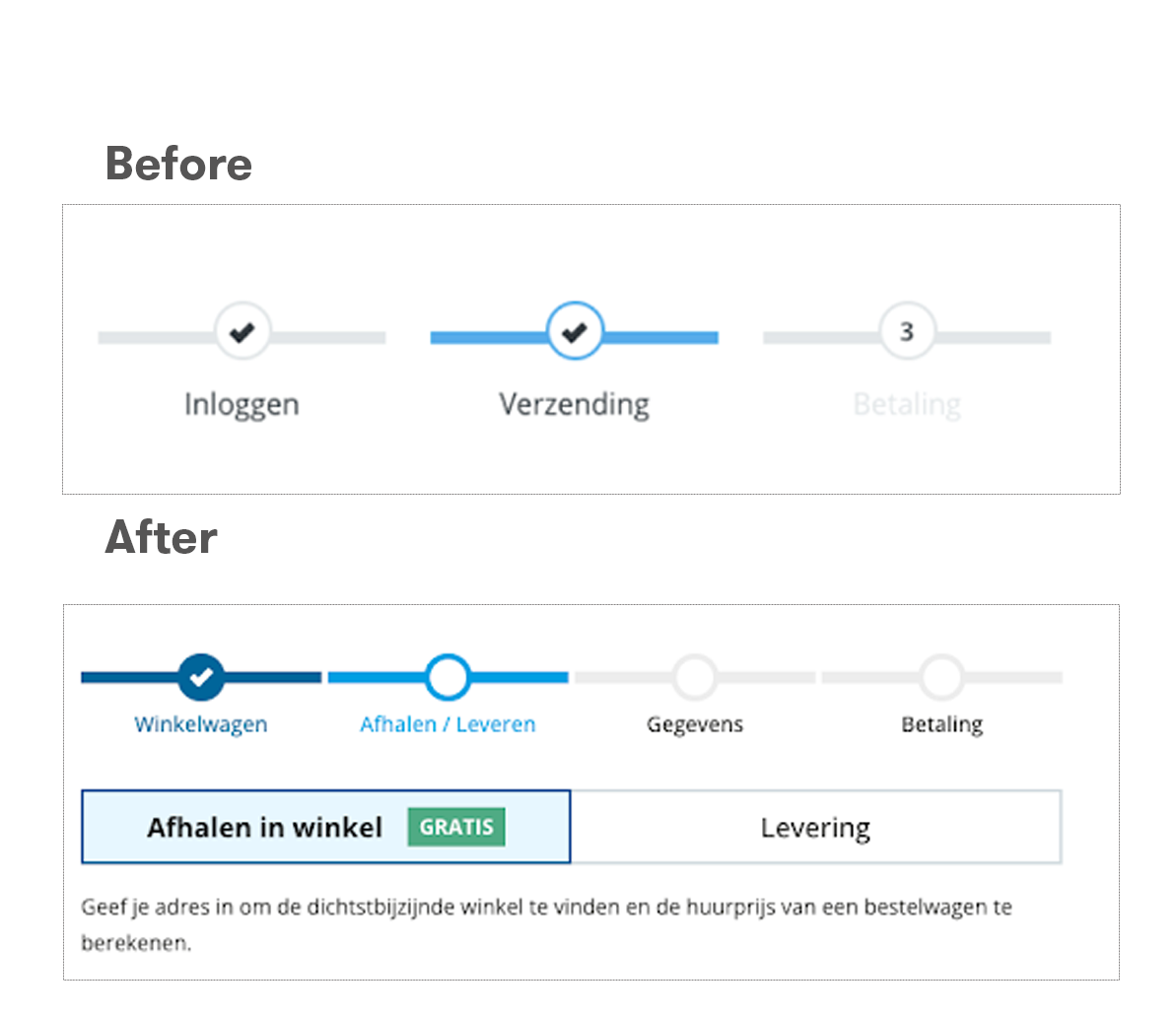
- Providing more clear stepper states
- Introducing tab switchers
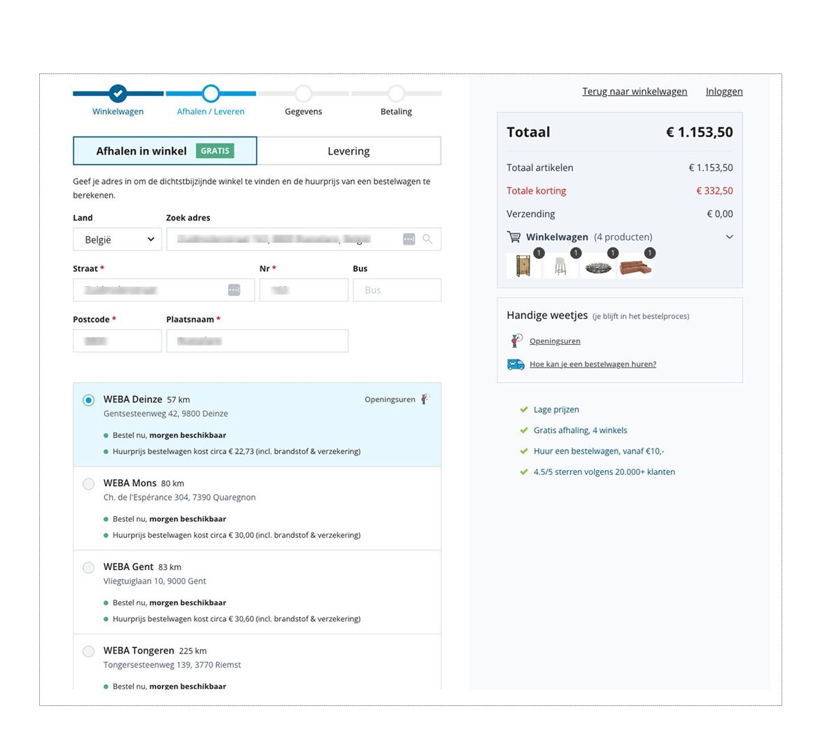
- Using an address-first approach
- Having in-flow FAQ access
- Emphasizing the actual total price
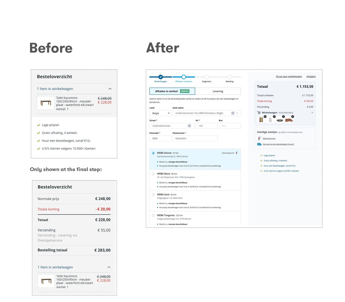
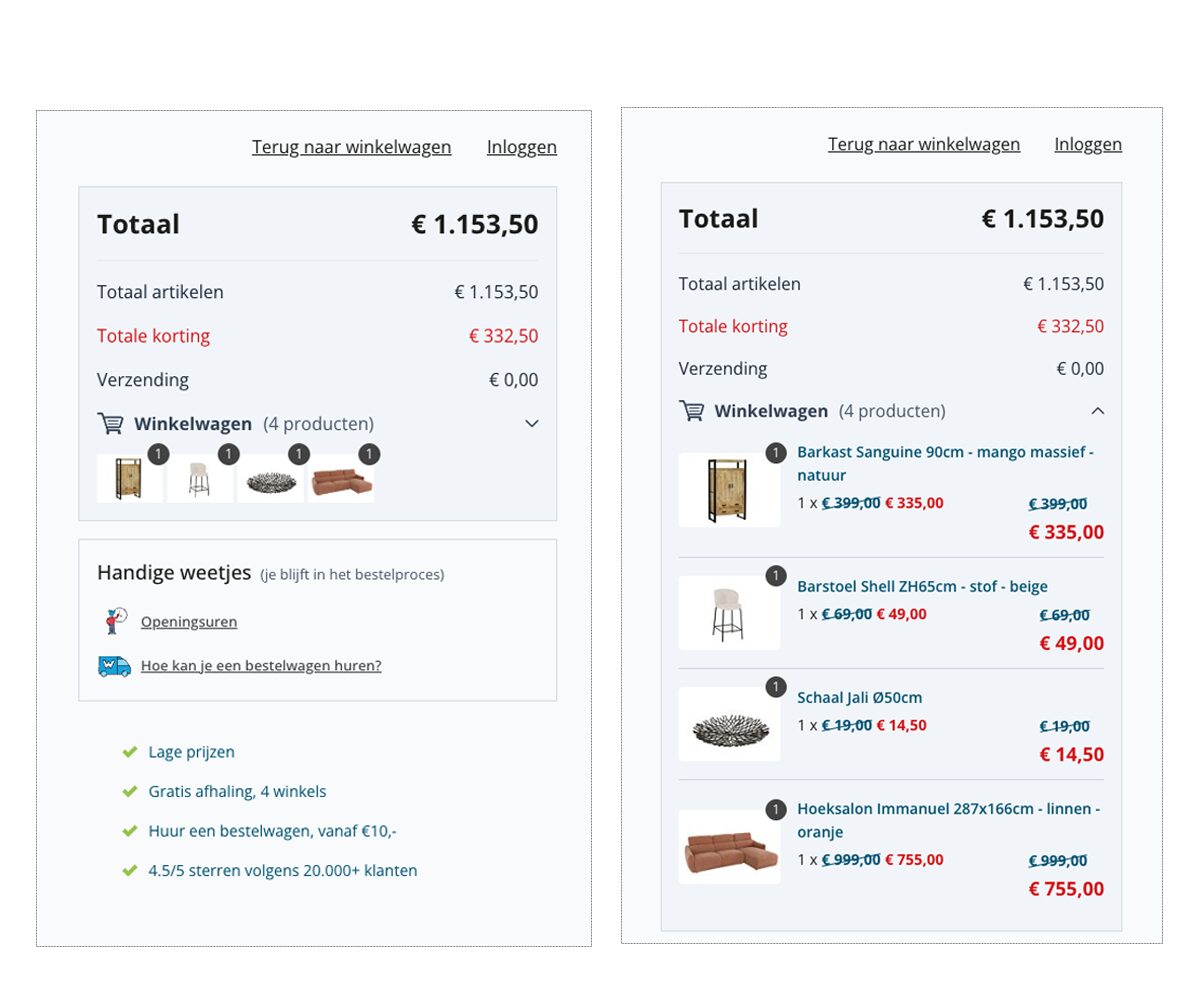
- Implementing compact, expandable product summaries
- Inserting subtle nudging toward in-store pickup
- Offering floor-based delivery options
- Incorporating distinct invoice & shipping details
Prioritizing guest checkout
One of the first changes was making the guest checkout option much more prominent, as customers usually prefer the option of a guest checkout.
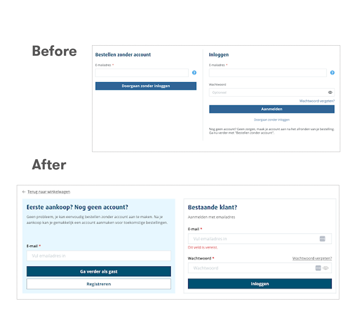
Previously, login and guest checkout had equal visual weight, resulting in users having to scan more to find the guest checkout option.
Instead, we made it easier to find by increasing its visual weight.
By prioritizing this path, we removed a major barrier and aligned with user expectations.
Clearer stepper states
We refined the checkout stepper to clearly indicate current, completed, and upcoming steps. The earlier design reused icons and colors in a way that confused users about their progress.
Now, each state is visually distinct, which builds confidence and helps users understand exactly where they are in the process – a key factor in reducing abandonment, as highlighted by Baymard’s checkout UX research.
Introducing tab switchers
To manage the complexity of multiple fulfillment options, we introduced a tab switcher. This uncommon but powerful component lets users easily toggle between delivery and pickup, keeping the interface clean and minimizing information overload. Segmenting complex choices into tabs follows the principle of progressive disclosure, making the process less daunting and more user-friendly.
Address-first approach
We adopted an address-first approach, asking for the delivery address as soon as possible.
This allows us to instantly calculate delivery costs, van rental prices, and store distances, even if the user ultimately selects in-store pickup. By gathering this information early, we not only improve the process but also auto-fill future steps, saving users time and effort.
This approach also supports business logic for pricing and nudges users toward in-store pickup (because it’s free and renting a van is less expensive than the delivery options), which is both cost-effective for them and strategically beneficial for Weba.
In-flow FAQ access
 Recognizing that users often have questions about logistics like van rental or store opening hours, we embedded quick-access FAQ links directly into the checkout flow at the steps where they are needed.
Instead of forcing users to leave the process to find answers, these modals provide timely, in-context help. According to NN/g and Baymard, in-flow assistance is crucial for maintaining user focus and reducing anxiety during complex transactions.
Emphasizing the actual total price
We made the total price more prominent by increasing its size and visual weight. Previously, users had to scan through discounts and subtotals to find what they would actually pay.
Now, the final amount is always clear and visible, which builds trust and transparency. These are two qualities essential for reducing cart abandonment, as underscored by Baymard’s research.
Compact, expandable product summaries
The product summary section was redesigned to be compact by default, with expandable details. This minimizes visual clutter and allows users to quickly scan their order, while still having the option to review specifics if needed. Baymard recommends collapsible order summaries as a way to improve scannability and user confidence.
Subtle nudging toward in-store pickup
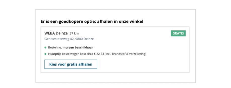 We subtly nudge users toward in-store pickup, because it’s the most profitable and logistically efficient option for Weba.
How?
By highlighting it as the default, cost-free choice and transparently showing potential savings compared to delivery.
This approach empowers users with all relevant information, including van rental estimates, so they can make informed decisions that align with both their needs and Weba’s business goals.
Floor-based delivery options
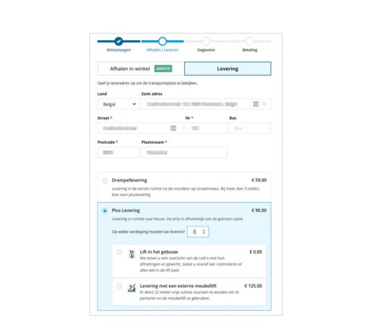
For users opting for delivery, we introduced a floor selection feature that allows them to specify the delivery floor, with associated costs and constraints clearly explained in a modal.
This dedicated interaction keeps the interface scalable and intuitive, even as we accommodate more complex shipping scenarios.
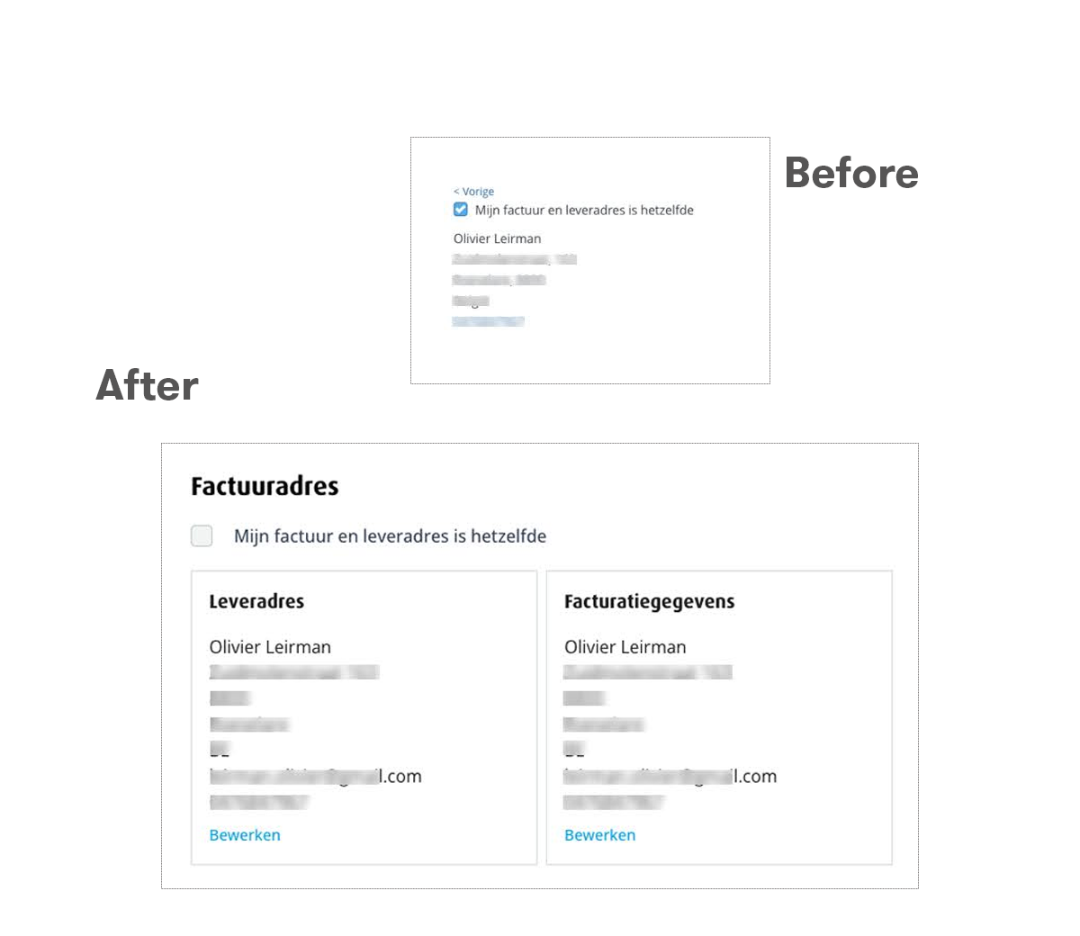
Distinct invoice & shipping details
Finally, we improved the design of the invoice details, as well as the distinction between invoice and shipping details when they are not the same. How? By simply wrapping each section in a separate card.
This visual grouping makes it easier for users to review and edit information, reducing errors and improving overall readability, an essential consideration in high-stakes flows like checkout.
Tracking updates post Hyvä checkout implementation
Taking decisions based on accurate user data is a high priority for both Weba & Baldwin. An improved checkout process required an updated tracking. Therefore, we made sure to update the set-ups and test all e-commerce events. From there, the marketing teams are configuring their reports and adjusting their digital efforts for better targeting and maximising ROAS.
Are you interested in the Hyvä checkout? Let’s have a chat.
