As a Magento agency running on Hyvä, every project starts in Figma. It’s our sandbox, our blueprint, our starting line. The standard Hyvä UI Figma library? Solid. Useful. But for the multi-brand, multi-layered projects we tackle, it quickly hit its limits.
Out-of-the-box library limitations
Working with the out-of-the-box Hyvä Figma library quickly highlighted a few roadblocks. First up: the component set. It’s solid for simple builds, but when your projects start stacking multiple brands, unique layouts, and evolving design needs, the library felt… limited. Flexibility? Not exactly its strong suit.
Then there’s the lack of advanced variables and modes. For single-brand projects, it’s manageable. But when you’re juggling multiple clients, each with their own identity, color palettes, and styling nuances, the standard setup falls short. You need a system that can adapt on the fly without breaking the underlying design logic.
Finally, scalability. The Hyvä library isn’t structured around atomic design principles. That means as your component ecosystem grows, consistency and maintainability start to crumble. For us, building repeatable, multi-brand patterns meant we had to rethink the foundation entirely.
Looking into solving the challenges
We realized what we needed was clear: a versatile, scalable design system that could support multiple brands, multiple projects, and still stay true to Hyvä’s clean, high-performance design philosophy. That was the spark behind the Baldwin x Hyvä component library. We needed a system built for flexibility, speed, and real-world e-commerce challenges.
So we built our own.
Meet the Baldwin x Hyvä component library: a design system built to keep pace with complex, scalable e-commerce. Tailored for flexibility, speed, and brand consistency, it’s our way of turning design chaos into smooth, repeatable workflows.
Introducing Baldwin x Hyvä component library
So, what’s inside the Baldwin x Hyvä component library? In short: everything we wish we had when starting multi-brand projects.
Atomic design principles
At the core of component library is atomic design. This is a method that breaks interfaces into small, independent building blocks that work together (like chemistry). You start with the tiniest elements: colors, icons, buttons, input fields. These are the “atoms.” Combine a few and you get “molecules,” like a search bar made of an input + icon + label. Group those into “organisms” and you suddenly have full-blown structures such as headers, product cards, or footers.
Why bother? Because once each layer is defined, you stop firefighting inconsistencies. Update an atom (say, a radius or a text style) and that update flows up through molecules and organisms automatically. Layouts don’t drift apart, designers don’t hack their way around limitations, and developers aren’t stuck re-styling the same thing ten different ways. It keeps everything clean, predictable, and fast to work with.
Advanced variables and modes
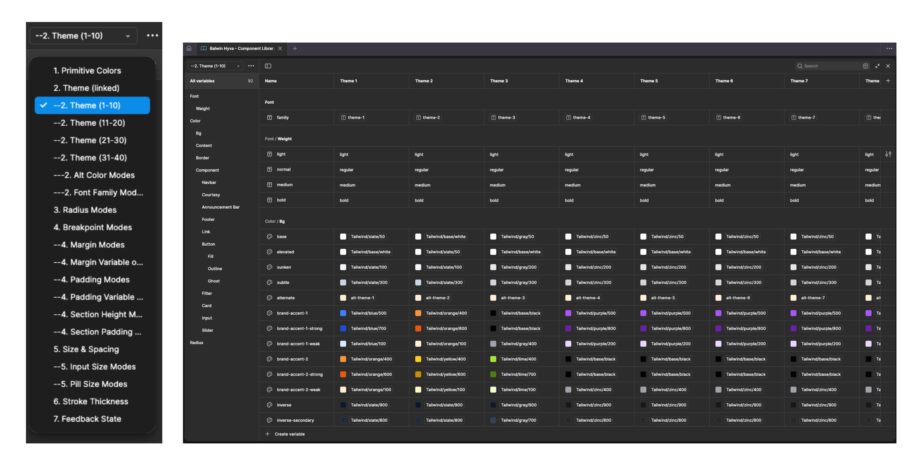
Then there’s advanced variables and modes. Colors, typography, spacing, layouts, they’re all flexible and easy to tweak. For multi-brand projects, this is a game changer. Swap out themes, adjust modes, or tweak individual elements without breaking a single component. Simplicity at scale, exactly what our workflow demanded.
Reusable components
And of course, the library is packed with extensive, reusable components designed specifically for real e-commerce workflows. From category pages to checkout flows, every element has been tested in production environments, making it fast to implement and effortless to adapt.
In short, we took the Hyvä design library and reimagined it for professional, multi-brand environments. The result? A tool that keeps designers, developers, and clients on the same page, without compromise.
👀Sneak peek into the component library
Product card demo
Color modes demo
Open for the community
After months of designing, testing, and refining, we’re excited to give back to the community that helped us grow. Our hope? To help other designers and developers speed up workflows, maintain design consistency, and create better user experiences. Without reinventing the wheel.
 “This library was created because we needed a more versatile, multi-brand design system. It features a component library built on atomic design principles, with advanced variables and modes to serve multiple clients.” – Olivier Leirman, Lead UX/UI Designer at Baldwin
The Baldwin x Hyvä component library is more than just a collection of components. It’s a production-ready design system for complex, multi-brand e-commerce projects:
- Atomic design structure for scalability and consistency
- Advanced variables & modes for effortless multi-brand theming
- Comprehensive component set built for real-world e-commerce workflows
- And now, it’s available to the community, completely free.
We’re proud to see this library not just as our tool, but as a resource for the wider Hyvä and Figma community.
Whether you’re building a single brand or managing multiple, it’s designed to help you level up your design system, save time, and build smarter.


